LEFT logo design


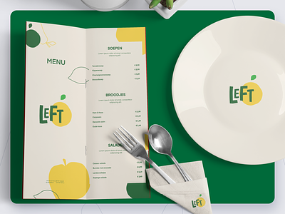


Nowadays supermarkets throws away a lot of food because it is not visually attractive anymore to sell. For example, a little dent in fruit. At LEFT you can eat these foods and you will see that these foods taste exactly the same. We at Make it Max had the opportunity to create their logo. The logo consists of their brand name and a (not perfect, but tasty looking) fruit. We also created their brand colors, fonts and illustration style.
EAT RIGHT
Want to work together? Don't hesitate to reach out to us at our tiki bar! (yes, we're not kidding)
makeitmax.design
Press "L" if you enjoyed this post and don't forget to follow so you'll always stay up to date with our most recent designs.
Thank you for watching