Popsqueeze - Logo Variations and Color Palette

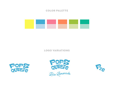
Color palette and logo variations for Popsqueeze.
Neon yellow, that represents lemons and lemonades, is the identifying color that recurs in all flavor variations.
Each of the 5 flavor variations has been matched with a 2 colors combo, one bright color and one lighter tint to create contrast.
The main product, bio lemonade with no additional flavor, was matched with a brilliant aqua blue to recall the concept of refreshing, thirst-quenching, pleasantly cold and to stand out matched with neon yellow.
Logo system includes main logo and monogram.
The main logo is modular. It consists of 2 elements:
- top element featuring the brand name, Popsqueeze
- bottom element that indicates the flavor