TFCO / Business Card

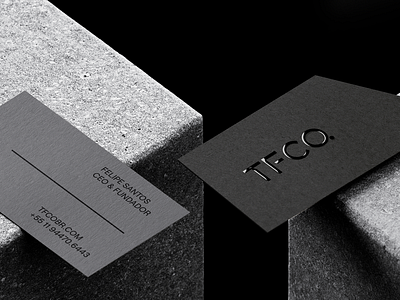
The visual identity developed for TFCO has solid forms with a notch in the 30º angle, giving personality and originality to the brand. The notch symbolizes the shadow projected by the constructions, the stretched letter F, symbolizes the process of applying the cellular concrete to the surface.