


Conceptual Identity Design : Ambigram Logo Variations

The final variations of a logo designed to initiate an identity image for web and possible print applications, for an exceptional artist/photographer/friend of mine.
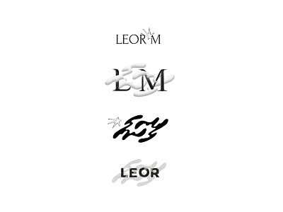
The visual objective was to utilize more irregular/organic forms rather than traditional graphic elements to correspond with the methods and ideas behind the artist's work. I felt this presented the appropriate opportunity to challenge myself with one of my favorite concepts in letterform design, the ambigram.
What seems like an anomaly at first glance, becomes the conceptual framework of design with intention. By introducing a clever twist with the ambigram, a sense of structure is given to the logo's main form of abstraction, an LM with interchangeable vertical orientations. The form can either function as the main logo when isolated, or act as a supporting element. When overlapped with other serif or sans serif letterforms, the organic shape of the LM introduces a strong visual contrast, suggestive of the multidisciplinary practices as an artist.