LyneUps logo refinement

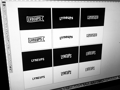

Refining a few of the logo ideas a little further and liking where these are going so far. Any crits to make these better? Check out the attachment for a better look. Would love some feedback!
Refining a few of the logo ideas a little further and liking where these are going so far. Any crits to make these better? Check out the attachment for a better look. Would love some feedback!