Card checkout

Hello fellow dribblers!
This is just a simple card checkout page for a fictional company.
Here are some of the key UI/UX elements and theories I used to create this design;
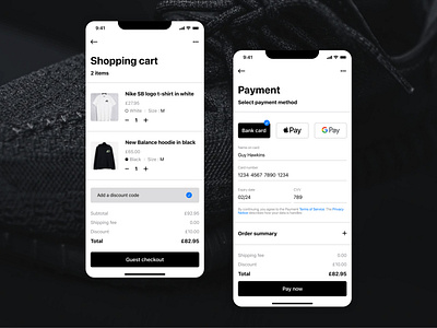
Multiple Forms of Payment
Convenience and security are shoppers’ primary concerns when they reach payment gateways, and they’re two of the top reasons for cart abandonment. Adding multiple online payment options helps alleviate security fears. Third-party payment options backed by trusted companies (like Google and Apple) may be more appealing to shoppers than entering credit card information.
Guest Checkout
Guest checkout may not be right for all eCommerce retailers, especially those whose business strategies revolve around generating customer accounts. However, it’s proven to accelerate checkout, prevent account-creation fatigue, and reduce cart abandonment.
A good alternative is requiring emails for order confirmation, then following up with deals in shipping and delivery messages.
Clear Order Summary
The payment page should give shoppers concise order summaries, here I have included the ability to click on the plus next to order summary allowing them to view their product details and quantities. There is a full breakdown of all fees along with shipping and billing information.
Customer Support
Support features like chatbots, return policies, links to FAQs, and customer support lines can be found in the more menu at the top right of the page. Shoppers may not use these resources at checkout, but they’ll have peace of mind knowing they exist.
Thanks for viewing. Let me know your thoughts below and anything you would do differently. 💫