


Catoctin Breeze Vineyard 'Piquette' Lettering

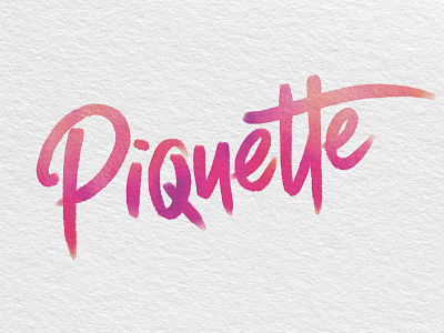
With a name as unique and interesting as Piquette (much like the wine itself), the moniker became the focus of our design. Inspired by the wine's spunky character, the new watercolor label features lively hand-painted lettering in vivid hues drawn from the Piquette's brilliant color and notes of raspberry and black cherry. Full of spirit, the new Catoctin Breeze Vineyard packaging design is as delightful and energetic as the bubbly beverage itself.