Music Player App Design

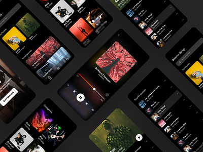
Lately, I did a design exploration for a music player mobile application. I aimed for minimal and functional design.
Trying this application in the dark mode was challenging and critical. Research has to be done before designing the dark mode.
Research Findings :-
** We use dark modes to reduce eye strain , make easier to read in a low light and also reduces battery consumption, so try to avoid pure white(#fffff) .Instead of using pure white, use slightly darker white(upto 87% opacity) which google recommends
** Avoid pure saturated colors, instead use less saturated colors, it will improve legibility.
** We use shadows in the light mode to express the elevation but it won't work in dark mode. In dark theme elevated surfaces and components are colored using overlays.
** High emphasis texts should have opacity -87% and for medium emphasis -60%