


Nora Posters


Hi Dribbble!
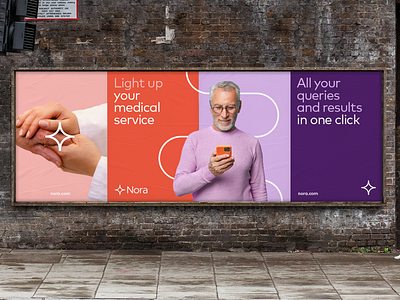
We continue exploring the health care app project Nora. In this post we dig dip on its branding application for visual communication were wanted it to be fresh and clear where colors, lines, shapes and imagery play an important role.
Talking about colours we wanted each of them to have their own role. On one hand we have the uses of lilac for “calm zones” were is not so important to call the attention of the reader. And on the other hand we have the use of the orange where we want to attract more attention and make it flashy for the eye.
On our last posts we showed you the Nora symbol that generates a system of lines. And as you can see this lines coexist with the imagery of the brand providing a graphic resource that fits Nora’s symbol.
This pictures with people are meant to make Nora a more humanised brand. And are carefully integrated together with the lines and curves following the idea of technology as something that connects to humans beings.