White Gecko Rail Logo Design Concept A


Logo design concept A for White Gecko Rail.
White Gecko is an existing business in need of a rebrand due to a change in the company structure and service offering from IT solutions to a rail operator on the QR network. This includes a slight name change to White Gecko ‘Rail’.
The company has a unique service offering, initially aiming to revive and modernise existing train cars into modern mobile work sites for track maintenance, but would later like to expand into a small rail freight operator and other complimentary services.
Our goal was to create a brand identity that is corporate and professional, primarily targeting large existing rail operators that they will be working with. We will aim to utilise their existing gecko symbol, modernising it, and making it more appropriate for the rail industry. It must work well on high vis work shirts with the potential to be applied to rolling stock in the future.
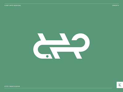
This concept uses dynamic geometric shapes commonly associated with the rail and transport industry, to create an abstract gecko. The bold winding shapes are reminiscent of railway tracks and form an abstract letter R for ‘Rail’. Green was chosen as it is the colour of geckos, whilst also being industry appropriate, and has a strong association with safety, an important aspect of White Gecko’s service.