Nilo logo

Possibly the logo of my own company. Heavily inspired by the Bauhaus font.
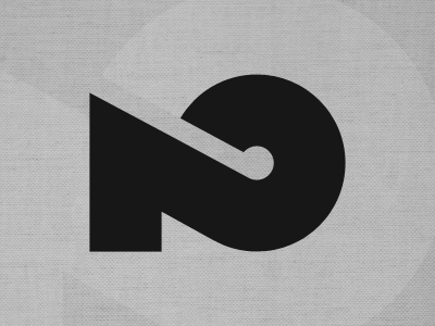
The whole story: in college I used this logo for my work. It's a self-drawn 2 (my lucky number) which represents an N-to-O (from NilO). Now that I have my own business, I wanted to redesign my logo. When looking for inspiration in several font families, I fell in love with the 2 from the Bauhaus font. So I took the 2, rotated it and redrew the shape a little bit.
But now I have mixed feelings. I don't feel like I've actually designed something. But then again: isn't this the same as a logotype? What's your opinion?