


Solstice Food Truck Brand Identity


Solstice is a food truck and bar based on downtown Omaha consumers. The food truck wrap was the most important application considering it would be seen on the vehicle between consumer and product. It needed to be eye-catching so using yellow (the first color immediately registered by the human eye) and red (evokes hunger and appetite) brings hungry by-standers to the truck.
- Menu
Using the same wave elements on the truck, the menu was divided into sections with this similar pattern. Inspired by the location, climate, and sun motif, the pattern needed to convey heat along with the main entree which is comalli (a seared meat paired with veggies on tortillas). Comalli comes from the Nahuatl word for flat griddle, "comal".
The griddle pattern was perfect for showing the audience what this restaurant was all about from just a glance. Paired with a rustic paper texture, referencing the to-go packaging, the menu feels familiar, simple, and shows the flavor of what is offered.
- To-Go Packaging
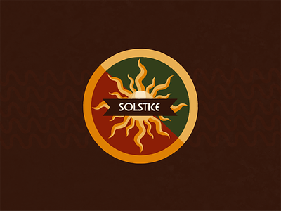
Serving mostly Aztec food, the logo had to convey the sun in a symmetrical shape which mimicked the sun emblems found in ancient central Mexico. I took a lot of inspiration from the radiating lines of designs used for the Winter Solstice Festival, also known as Panquetzaliztli which the society feasted as a celebration of the birth of Mexika civilization.
Using paper packaging redefined the rustic food menu and brings the consumer back to basic roots of handheld food in its most basic and tasteful form.