Rio Art Orquestra Academy | p.1

This project basically opened my eyes on how to manipulate emotions through design. The logo in question is for a musical school, created and maintained by the Rio Art Orquestra.
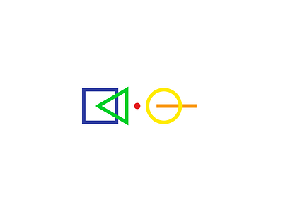
In this logo I wanted to express the simplicity and beauty of music. Each shape represents a certain idea about music and of us being human.
Left to right: Creating, Sharing, Being, Exploring, Remebering.