Channel8 Logo Concept


esign 1 or 2?
.
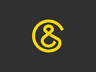
I'm currently working on a branding project for a media called channel8. The following is the design which is approved by the client. However, we're still in the discussion whether or not to add an 8 to the logotype, considering that the figure also resembles an ampersand. Let me know what your thoughts.
Moreover, if you have ever seen such design somewhere else, please kindly let us know so we can think about the alternative.
Thanks all.
.