


Quetz – Packaging.

Quetz is an upcoming skincare brand with a strong heritage and proud of its mexican roots. Their formulas are inspired by nature’s most high-performance ingredients, such as chia, nopal, agave, tuna, and aloe, and their products are created following traditional hand-crafted processes. Quetz aims to become a staple line of skincare products based on two ideals: sustainability and performance.
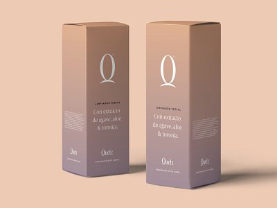
Quetz’s visual identity is inspired by the colors in Mexico’s stunning sunrises, using this as a metaphor for relaxation and the fresh sensation of a new day. Quetz’s wordmark was constructed based on a custom lettering piece of serif letterforms with a generous x-height, high contrast, and elegant and stylized shapes to highlight the luxury experience and high-end quality of the products. Quetz’s icon, the letter Q, is based on a rising sun behind a hill, accentuating its main concept.
You can see the full case study here: https://www.behance.net/gallery/121071325/Quetz