Album Cover Redesign (Alice in Chains)

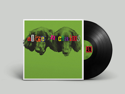
Part of a personal ongoing project to redesign an album cover once a week. Alice in Chains covers always instill a feeling of anxiety and uneasiness in me, so my goal was to achieve that on my own terms. One of the toughest challenges for me was tackling the word mark. Their label is hand drawn and translating the same feeling that their logo communicates stumped me quite a bit at first. It felt like no one typeface could do the job right. Quite literally my thought process was if one doesn't work let me just try 5 or 6 different ones at the same time. The original cover has a 3 legged dog on it, so I kept the dog theme with photographs I had taken, bitmapped them and overlayed over a similar green that is on the jewelcase of the original physical cd that I have.