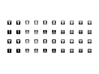
Fav(icon)ourites Rebound

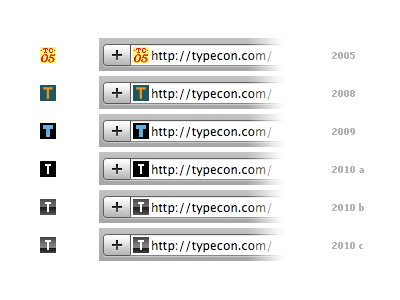
Here are the favicons from some previous TypeCon site incarnations, compared with three variations pulled from my previous shot.
I’ve stuck with the plain square shape without the single pixel, rounded corners. I’ve also chosen the thinner ‘T’ to match Silas Dilworth’s Heroic Condensed typeface, which is being used in the rest of the current graphic treatments.