Trencherman Fine & Rare
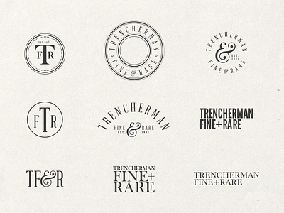
Some of the ideas being generated for the re-brand of Trencherman Fine & Rare a fine food company from Barnard Castle in the UK.
My initial thoughts are rubber stamp, fine, serif, sans serif, family run business, jam jars, local food, brown paper parcels wrapped with string, organic, game, rare, direct from source, natural and home kitchen.
I want the brand to feel very modern, it was established in 1981 and has not been through a re-brand since, so I want to bring it up to date but still retain an older finer feel. They want to appeal to a younger, more kitsch, cooler market while still appealing the lords and better off folk that they supply.
Moving forward I will be refining the ideas as well as coming up with more, hand drawn type will be my next approach. I will also be thinking of the packaging the products are sent out in. But also to explore imagery from the word game, so think pheasant, hunting, rabbit, hare, grouse, pigeon, partiridge and things like that, I will explore these with small illustrations.
