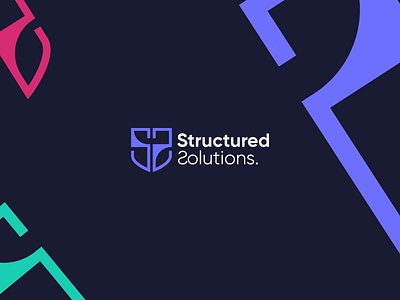
Structured solutions - logo design

This logo was created for a financial service company in the United states.
After doing a bit of research into what financial services logo look like. I decided to pick two of them as a reference point to ensure I create an identity that competes internationally.
what two financial service companies did I use?
1. Standard chartered because of its international reputation.
2. Stanbic Ibtc because they incorporated the shield (security, trust) as well, which means it must have so much significance in the fintech space.
I decided to create an identity that didn't sway too much away from these logos so we don't end up looking like a company that produces biscuits. I used these two as guides because there's already a generally acceptable and familiar way that financial services logo tend to look like.
Stanbic IBTC gave me all the validation I needed to incorporate the shield, even though the brief said it wasn't compulsory. I utilised a very bold font to depict strength and reliability, which is key in the financial space.
This concept was not approved by the way