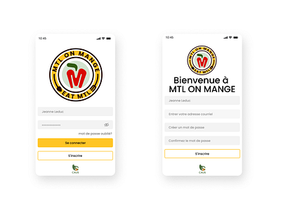
MTL on Mange/Eat MTL (PWA): sign in and log in
I read recently somewhere on Medium that having a vertical visual look for the mock-ups as UX/UI design was bad because it doesn't help it visually despite it looking good. Well, it's a good thing I post it without an angle because I don't have a pro 😅!
🙌Here is a simple sign in and log in page for consumers and vendors to have access to the progressive web application 😄😄😄.
And is it only me? I'm posting it as recommended (1600 x 1200) but it's still showing a bit blurry unless you click on it🤨? Strange...
👇Feel free to like or comment!
👉Here is my website if you want to check out my process: https://sun-kim.ca/mtl-on-mange/
👁👅👁Here is my own medium article I wrote about in VR and its social benefit: https://sun-kim.medium.com
👉Here is a short prototype if you want to check it out first hand: https://www.figma.com/proto/K1wKScekdynGbj63e9JP7N/mtl-on-mange?node-id=1306%3A10&viewport=1135%2C39%2C0.14151731133460999&scaling=scale-down

