Mcon

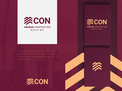
A crafty hint in the form of a building structure is the real deal for this construction company logo. MCON is short for Mehrab Construction. In the logo, the abstract icon not only refers to a building but also conveys an impression of the letter M. With the addition of CON, it makes a standalone brand identity. Since the company operates in China as well, the brand name in Chinese is also added to the logo.
___________________
Press “L” to show some ❤️
Are you looking for a logo (re)design for your business?
I’d be happy to hear your story! Feel free to reach out!