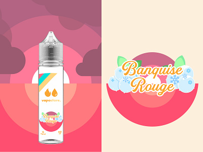
Vapostore packaging "Banquise Rouge" flavor

This design is part of a series around a rework on a French e-liquid brand named "Vapostore".
The goal was to make people want by associating color with taste.
On my own perspective, this shot is the most beautiful one of the series, mainly thanks to the color balance.
The current packaging of this flavor is just light blue colored writing. But, to me, that choice means that you are skipping the gluthness of the red berry gluttony and producing something too bland, which is exactly what you want to avoid in such circonstances.
That's why I preferred to show frozen fruit in a warm background
My research to make something frozen in a drawing took some time. But, pretty soon, I figured that mixing a pale blue with something that looked like stalactite and snow was going to be the perfect shot.
Am I right, people ?