Las Vegas Raiders :: Branding Redesign


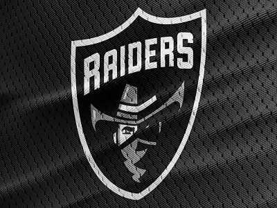


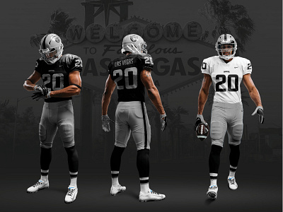

To mark the NFL Raiders franchise’s 2020 relocation to Las Vegas, we thought it was time to consider a brand refresh that was more appropriate for the team's new home, while retaining many of the familiar aspects that fans have loved for decades, such as the distinctive shield design and sleek silver-and-black color palette.
The original pirate mascot was a casualty of their move to the landlocked desert, as we felt that their nickname could apply just as well to an outlaw/bandit character that would make more sense for Nevada.
We approached the typography differently as well, opting for arched text in the wordmark and incorporating a weathered texture that would feel at home in the Old West.
—
Looking to take your brand to the next level? We would love to hear from you. Email us at hello@llt-group.com