


Custom Lettering/Logotype for Retart

The Client (Retart – an independent label from Slovakia) was going to celebrate 10 years and was ready to refresh the look of it's logo.
After series of sketches he ended up choosing the one, which was a little "messy". In that time it was a no-contrast line. The direction was set and it looked good, but it was still not finished.
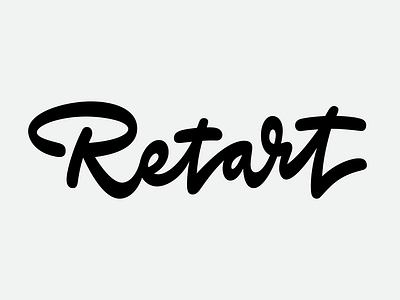
The lettering still needed some "calligraphy" and "more cool". After some time I did not look at the logo, it suddenly went very easy to finish it with a "few polishes" and was completely redrawn.
The final version has nearly similar skeleton with the chosen sketch, but the overall look is very different. We also struggled (me and client) with the right one look of the letter R. That was a challenge.