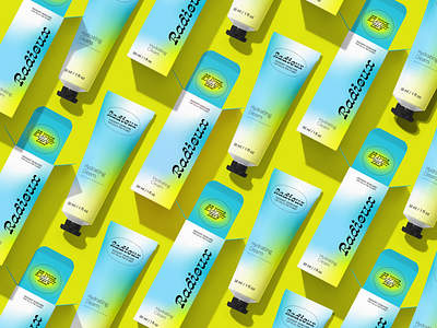
Repeating Pattern of Hydrating Cream Packaging Design

My Process
BRIEF
‘Radieux’ being a fictional eco-skincare company based in San Diego, California, the brief was to make sure the packaging catered towards a youthful population. They wanted to emphasize the meaning behind their brand, ‘Radieux’ meaning radiant, shining and brilliant. They needed a brand identity to launch their new company. ‘Radieux’ needed a fun, colorful color palette as well as fonts that matched their aesthetic. They always wanted the viewer to know this was an earth-conscious brand.
CHALLENGES
The biggest challenge I faced was how to create a youthful brand without it looking exactly like so many other skincare brands on the market yet still trendy. There’s always a fine balance to walk when it comes to being trendy in design vs. having a design that will truly stand the test of time. I debated on using the gradient style as I know it’s a big current 2021 trend in the design world. I ultimately leaned towards that as a motif in the packaging design as it really does encapsulate the meaning of the word ‘Radieux’.
GOALS
The goals for this project was to have it obviously trendy but also minimal and timeless enough that the product will look good and interesting to the consumer a year from now. The gradient, though trendy now, has been used in past years so it’s not exactly something that only 2021 could produce. I wanted this project to really feel like the meaning of the brand’s namesake.
UNIQUE SOLUTION
Once I had gone through my research process and started creating some possible solutions to the brief, the final solution became a gradient packaging for 2 of the companies products, as well as a color palette and brand font guide.