ShiftNudge / Typography / 2
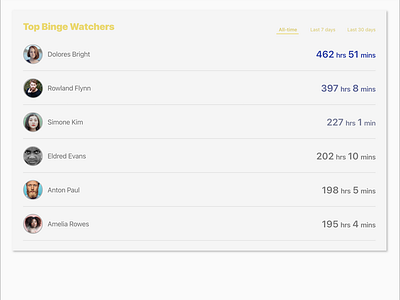
Hierarchy / Leaderboard
Most important piece of information is to show "top score" (score being... time watched, whatever they're watching.)
The interesting part here is, when I re-see this when uploading, I figured it might be better to align "hrs" and "mins" across all rows...
It really amazes me how I can achieve this visual rhythm with only 3 font sizes used: 28pt (title and time watched's numerals), 20pt (names and "hrs"/"mins"), and 14pt (filter controls)
Avatars generated from uifaces.co.