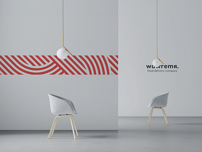
wowremya — brand design
Wowremya is a food delivery service with a delivery time guarantee. There is a lot of competition in this area; and we needed to convey the brand's mission “ a quality service and a fast delivery “. In the project work course, we used an unusual technique and started from the end and backwards: we started with creating a corporate identity and only after it was completed, we made the logo. We wanted to convey a lively and colorful image. Therefore, we developed a bright palette of corporate colors, various patterns that conditionally reflect the time, diversity, movement and speed of the company. It was decided to make the logo simple and minimalistic. We've added a dot accent at the end of the company name as a statement and a promise of reliability. As a result, we got a strong, but at the same time simple name that distinguishes the brand from competitors on the service level. And of course, all that is summed up in a stylish and dynamic design.


