H2O BOSS Logo Re-Design

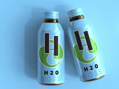
I kinda always knew that I have to do this, because they are the guys who deliver purified water in our subdivision. I knew in my head what kind of design I should make though it took a lot of explorations before I settled with this option. I was going for a geometric, industrial and with only a touch of an organic form, though I really doubled down on a grid and even used geometry to create the river.
I was pushing for something like a water droplet that looks like a neck tie or something like a wave of neckties, but I gave up on that idea, because it wasn't working for me. I though that I could get away with a letter "H" and a number 2 under it that acts like a wave, but it looked too forced. Thus, the number 2, became a river and everything made sense.
I still made an option B, trying to see where it could be taken further, but I just really like the Option that I settled in.
p.s. I can't really find a free mockup for a water gallon that's really really good for presentation that's why I opted for a aluminum water bottle.