


Reformas na Suíça

This project was all about transforming a boring, time-consuming and complicated process into a fast, easy and transparent one, answering retirees' prayers by offering a variety of services that respond to the different circumstances and situations retirees may find themselves.
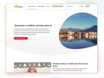
The design was developed around its target audience and our main goals were simplicity, easy access and trustability. The focus was on facilitated accessibility, an effort to maintain care in direct and objective communication. We’ve used icons and visual elements to help with the perception of information. In terms of available languages: Portuguese, French and German were chosen due to being the most spoken by the target audience..
As for the colors of the logo which persist throughout the website, they range from red, green and yellow - the colors of the Portuguese flag. This palette appears on the buttons, tabs and images for a cohesive and uniform communication. We also aimed to have some kind of relatability to official institutions which may be perceived by the client has reliability.