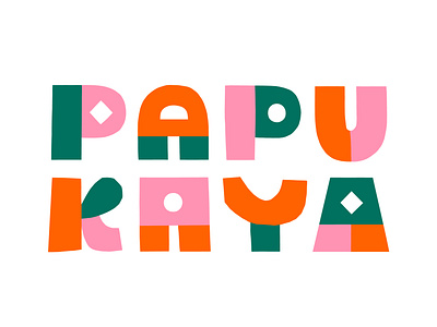
Papercut logo for Papukaya

LOGO DESIGN for Papukaya 🦜
In the end of 2020 I had the chance to help out a new Finnish gaming company build their visual look. I was asked to create a visual identity, a logo and a set of illustrations for them.
Papukaya is all about doing thing a differently and questioning the status quo of the gaming industry. They build games with the gamers’ real needs in mind - especially for women and those who don’t consider themselves as gamers.
This is why they wanted to have a visual identity that challenges what gaming companies often tend to look like - masculine, dark and digital. Together we created a look that’s fun, quirky and playful. I created the logo and the illustrations with papercut to achieve an edgy, handmade look.
Papukaya means a parrot in Finnish. The visual identity portrays the many fantastic traits parrots have - they come in different sizes and colors, they’re avid learners and are bold in their existence.
Papukaya is formed by a group of fantastic gaming professionals with a background at Supercell. I’m looking forward to see how their exciting journey unfolds!