Casa Medel

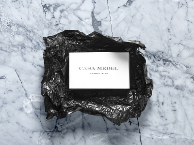
We kept the classics the way they should always be maintained along with their colors, locations and applications, using an almost wide and close typeface to keep the essence of time well structured, just as the tones of the marble would remain unaffected overtime.
Press "L" on your keyboard and drop a like 😍
Don’t forget to add comment and follow.
thnak you.