Patientory Color Palette

Establishing the Color Palette
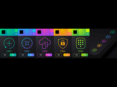
From the start, we decided to bring in a saturated, color gradient palette for the design language while striking a sharp contrast with deep black. A large, majority of healthcare apps look somewhat pedestrian. Since the modern design trends lean toward vibrant, color gradients, this was a sound design foundation to work off of.
To see the UI/UX design project in full go to: https://www.theskinsfactory.com/patientoryuiuxdesign