GM General Motors Monogram Logo Mark Redesign
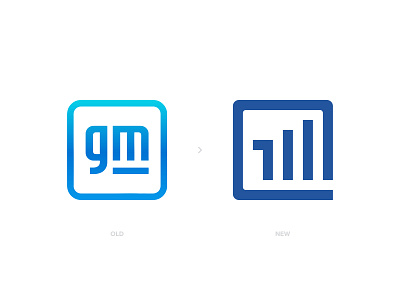
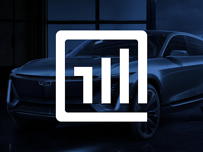
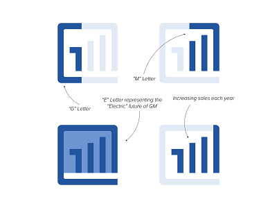
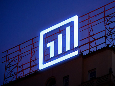
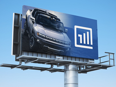
GM recently updated their logo. I think we could add more to the current design.. With my new design approach, I combined G letter + M letter + E letter for "Electric" and an increasing bar graph that represent soaring sales..
I also hate the gradient look on the logo.. So I used the blue they were using on their older logos.
Let me know your thoughts please, its always great to listen your feedback 🙏🏻
Please Hit " L " if you liked my work, helps alot 🙏🏻 Thank you for your support..
------------
http://www.designermurat.com
hello@designermurat.com
Need a new logo design? Email me or visit my website to see all pricing and packages I am offering in detail..
branding
electric vehicle
general motors
gm
letter mark
letters
logo
logo mark
logo redesign
mark
monogram
redesign concept
View all tags
Posted on
Jan 25, 2021
More by Murat Bo View profile
Like

