Give You The Sky

An exploration of space, hierarchy, flow and most importantly tone.
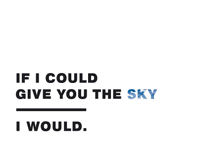
The negative space above the type is meant to feel grounding, like looking up at an empty sky from where we stand - on the ground. This immediately gives the design a more down to Earth, hard-reality feel. The line dividing the two sections of type is just that - a visual break. Meant to separate the dreamy "could" from the realistic, harsh "would". With little negative space below the last piece of type, we are left with a concrete conclusion. I would (but I can't).
I know what this means to me. What does it mean to you?