Letter P
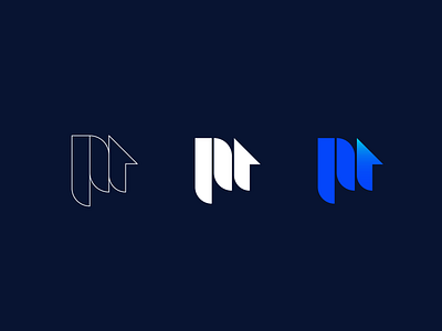
The design of the symbol is a combination of the letter "P" and the symbol of the house which means property as the main value of the brand, the house also has the up arrow that explains the growth and longevity in the right and correct direction of their business path.
The symbol is presented in three parallel lines that are cut into three different shapes: Square cut, circular cut and triangular cut, forming a connecting bridge between the categorized products that the company will offer to its customers.
The symbol and the colors work closely together and represent a modern and safe spirit.
View all tags
Posted on
Jan 7, 2021
More by Andi Berisha View profile
Like

