Secret Society Goods Homepage Redesign 1 of 2

I fell in love with Secret Society Goods in 2016, but I feel their website doesn't do justice to the brand. So, I redesigned it.
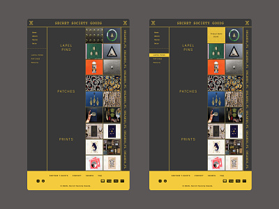
- I simplified the Main Navigation bar to what I believe are necessary and placed all of the secondary nav buttons in the footer.
-I went for a minimal design to drive users eyes to the I fell in love with Secret Society Goods in 2016, but I feel their website doesn't do justice to the brand. So, I redesigned it.
- I simplified the Main Navigation bar to what I believe is necessary. I placed all of the leftover nav buttons in the footer.
-I went for a minimal design to drive the user's eyes to the product grid.
-The product overlays that appear when the mouse hovers on the original website completely block the product's view. I decided to have a lighter colored overlay at 90% opacity to add more contrast to the product photos' dark colors.
-I created a grid to display their most popular products (I have no idea if this is their most popular.
-SSG has over 100 items on its website. I added a sales button, so they have a space place product that they need to move.
- I added secondary navigation that will allow you to quickly move between product categories while scrolling.
I will be posting a FIGMA prototype soon to have a better idea of the website's function.