More Life CBD - Branding

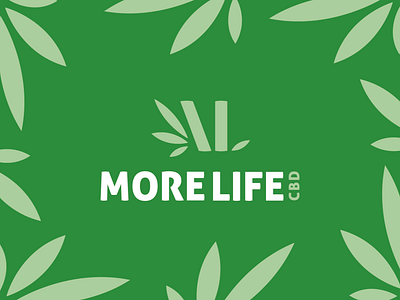
The leafy green stems are in a subtle shape of 'M' to symbolise the 'More'. The leaves are in minimal design to help with the natural feel of the brand, also suggesting what it sells (CBD).
The typography is clean and sleek sans serif called 'Aller'. This is a great font especially for a natural brand as it's strong yet clean.
Let us know your opinions on this logo!