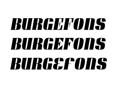
Display font E & F
Hello folks. I've been working on this display font on and off for a while now and I can't seem to get the E and F to play nice with the other glyphs.
– The first suggestion creates to much whitespace.
– The second one solves that problem but introduces the triangle arms which are not used in any other glyphs.
– The third one: The E kind of works for me but the F does not.
Any help or input is appreciated.
More by Erik Iggmark View profile
Like

