Hewlett Fitness Workout Logo

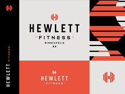

I decided to turn one of my H logos into a real logo. This one is for a fitness center, I chose the name at random. I liked how this mark reminded me of a weight (also I haven't been to the gym in 8 months due to covid, maybe I'm just dreaming about going back haha) Anyway, I paired it with a logotype, colors that were inspired by energy, and a custom pattern based on the logo. I liked how the pattern was forming interlocking shapes, like on a weight rack.