Syme Tyme Cafe Logo

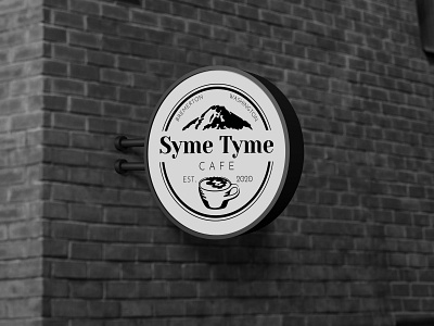
This was the proposed logo for a new business, Syme Tyme Cafe.
The owners of this company sought to have a logo that communicated traditional, classic values combined with trendy, luxurious styles.
The double lined circle encasing the center elements, the stylized mountain and coffee cup are a call back to the classic, traditional styles of the 20th century. However, the use and choice of typography within it, specifically the combination of delightful serif with clean, thin sans, reflects design choices of the modern era.