Procreate App Redesign

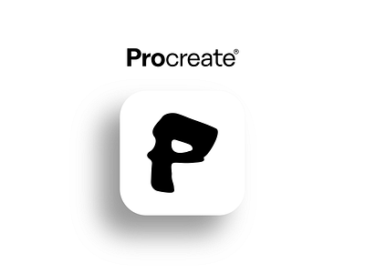
A simple redesign for the Procreate app.
You can see a hidden face in the letter P because I love that people can be creative with the app, and that is also what I believe Procreate stands for!
A simple redesign for the Procreate app.
You can see a hidden face in the letter P because I love that people can be creative with the app, and that is also what I believe Procreate stands for!