Procreate Icon Redesign

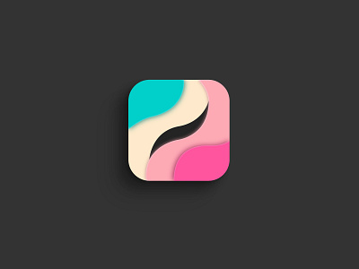

I decided to fix up a little bit the shapes of the pictogram to give it more consistency and much more ease of reading, thanks to the circles.
Then the abstract lines and shapes around it are a reference to the layers of the app in use. The overall idea is a cut through pages of paper as if they are surpassed.