Pioneer Dental Arts Logo - Rejected :(

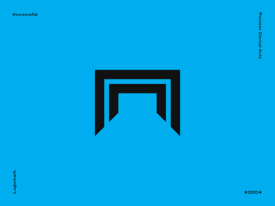
One that didn't make the books - an aggressive logo for a new and upcoming dentist in the Northwest Washington network.
In this logo, I attempted to walk away from all of the predictable swirly dental logos that we have all seen. By doing this, I was trying to combine the attitude and outline of a tooth, but also pairing it with "pioneer" -- a carriage.
Client: Pioneer Dental Arts