Visual Identity - Redesign Logo

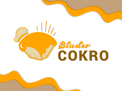
Hello, this is the redesign of the Bluder Cokro logo. The logo designed using a flat design style that seems more minimalist, simple, and can convey messages faster than very detailed illustrations. The flat design drawing of a bread grinder shows a universal action or purpose so that everyone can easily understand how a soft and fluffy toaster looks and tastes. The yellow logo is used to stimulate customer hunger by triggering positive memories of the distinctive taste of bluder bread food.
The shape of the chef's hat means that the bluder bread is made by a chef who is an expert in his field, so that the taste and texture have its own characteristics that other products do not have.
Also don't forget to visit my behance account, to find out about this logo design process : https://www.behance.net/putriayundaf