JB AUTO Branding Pt 05

CB Design Production: JB AUTO Branding Part 05
Full project can be found on my Behance
Client: JB AUTO
Area: Auto Service
Year: 2020
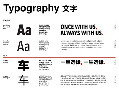
JB AUTO is an auto service group located in Shenzhen, China. The group has four divisions: JB Showroom, JB Mods, JB Service and JB Mechanic. Our goal is to create a simple, bold and clean look and feel.
We started with the logo and combined the letter “J” and “B” into a bold symbol that looks like italic stencil typography. A 15° forward tilt angle gives the logomark a sense of speed and moving forward. The three-strips form was created to represent JB AUTO’s motto: Professional, Reliable and Reasonable.
To keep the consistency of the whole branding visual, we mirrored the three strips vertically and transformed them into three up arrows, which can also be used in way-finding system.