IAMFlamenco

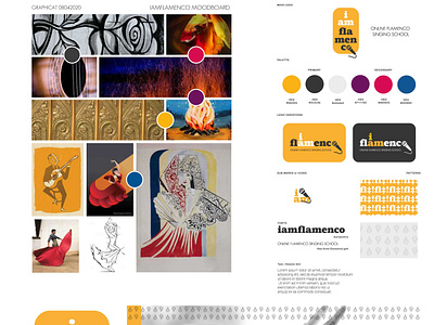
We'll just give you what the client Yota Baron Flamenco Productions said about this logo: "When we discussed about having a logo for this project, we wanted something fresh, dashing, away from traditional script fonts because we wanted to be different, bold, and communicate our love for singing in a more contemporary way. The deep grey colour is for timeless, white for purity of emotions. The orange colour comes to make a statement. We’re here to give you quality and share our passion and solidarity with every you out there who just want to sing directly from your heart!"