BKI-I Logo & Brand Identity

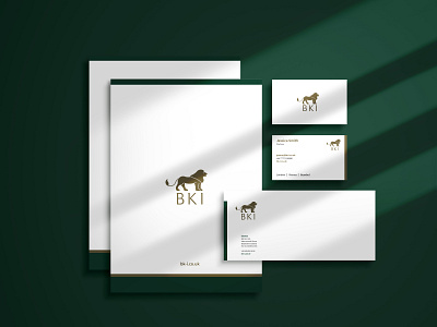
BK-I Limited is an international consultancy that advises architects, designers, and procurement companies on Furniture, Fixtures and Equipment, lighting, tiles, natural stone, and other surface coverings.
The client wanted to emphasize reliability, premium quality, and leadership with a historical symbol to emphasize the company's focus on culture. In Mesopotamian culture, the lion is regarded as the symbol of courage, bravery, royalty, and chivalry. So the lion figure is chosen to symbolize BKI Limited.
The icon was developed with the help of golden ratio circles. The lion's right-facing profile view represents the forward-thinking and innovative approaches of the brand. The front legs are standing still to convey the feeling of reliability whereas the back legs are in a movement to represent growth and development.
The main attributes of the company were achieved with the coupling of the strong, vibrant 'Jaguar Green' and a premium gold color.