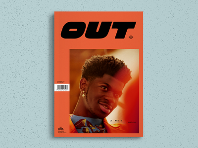
OUT Magazine – Cover Redesign Concept

Queer representation is an incredibly important issue for me which is why I have a soft spot for OUT magazine. While the magazine has tried making efforts to be more inclusive, to not only cater to an older, gay male audience, it's still quite cringeworthy.
From a design perspective I wanted to envision what OUT could look like for a younger, more contemporary audience.
My inspiration for this was equal measures of The Designers Republic blended with David Carson, which yielded this super vibrant, bold, and totally over-the-top manifestation of queerness. This is what it looks like to be an OUT and proud human.
Photo: Michael Schmelling