Skouros Branding
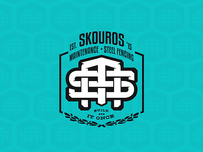
Brand, Visual & UI Project for @skourosmaintenance , a 5 year young, local metal fabrication & domestic/ commercial maintenance company with over 10 years experience on the tools. • The Design Problem: To shrewdly address the 3 distinctive fibres which make up what the Skouros M & S.F. brand represents; Premium Welding & Maintenance, the ‘Build it Once’ mantra & the company values. • The Design Solution: A timeless monogram which evokes the strength of the companies premium delivery of works and a ‘build-it-once’ mentality. The logo is inspired by vintage monograms, metal fabrication & the flag of Cypress. • The End Result: Is a proud and timeless visual identity, purpose built to thrive in any digital or printed environment.
brandid
branding
colorpalette
cypress
design
digitaldesign
graphicdesign
iconography
logo
logodesign
metalfab
monogram
styleguide
typography
ui
uidesign
ux
uxdesign
visualdesign
webdesign
View all tags
Posted on
Nov 16, 2020
More by Gianluca Caico View profile
Like

