Team Alex Logo

Following the tragic death of our son, brother, uncle, cousin, nephew in May of 2019, Al’s family made a commitment to do everything in our power to stop other families from having to go through this pain. Over the past several months, we have been engaging with our community, friends, professionals and anyone with a passion to help prevent, suicide, bullying and depression in our youth. We have a team of supporters who are passionate for our cause, along with finding alternative ways for others to improve their mental health, self-esteem and issues steming from social media. Over the last few months, we have been meeting weekly to create our program.
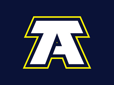
For the brand identity, the letter "A" creates our logo. It stands for leadership and more importantly, it stands for Alex. The colour yellow is used to reference suicide awareness while the dark blue symbolizes saving lives. Combined, both colours create a visual contrast and are timeless. Our goal was to create a brand identity that is age friendly, appealing for sporting events, organizations and community outreach. Most of all, we wanted to ensure our logo honours Alex.